Tuesday, 19 July 2016

Revit Ideas Forum

If you haven't already heard, back in May this year, at the Revit Technology Conference, Autodesk made an announcement regarding the new 'Revit Ideas Forum'. Essentially an official Autodesk space for everyone to post their product feature wishes! 

As expected, there are plenty of wishes being posted. As ideas gather support, Autodesk have recently marked a number of ideas as "Under Review", due to their popularity. As of today, the ideas marked are:

  • **"OR" function in filter rules
  • PDF linking support
  • **Dual monitor support
  • **Double patterns
  • Separate family browser
  • Sloped walls functionality
  • Ability to sort schedules in project browser
  • Topography improvements
  • Ability to create blank tables
  • Auto spell check
  • Improved stair functionality and control
  • Shared parameters in key schedules
  • Non-rectangular scope boxes
  • Improved view placement on sheets
  • Spell check in schedules
  • Autodesk Revit Viewer improvements
  • **Multiple selections in dialog boxes (such as filters)
  • Worksets in templates
Not a bad list so far. I have posted a couple of my own as well, (3D measuring, wall type reporting in doors & improved warnings dialog) so head over and vote or make a wish! 

In the forum, Autodesk have provided some options to filter the ideas, to make it easy to see all those under review. I noticed "Implemented" is one of those options. Obviously, as this is all fairly new, there aren't any currently marked as implemented, but no doubt Autodesk will be looking to change that fairly soon! I am quietly confident we can expect to see some of the above possibly as soon as 2018 release. Fingers crossed!! 

Update 17/08/2016
**As of this week, Autodesk have started marking ideas as 'Accepted' and added the idea to their 'road map'. Woo!! I have therefore updated the list above with asterisks for items marked as 'Accepted' at the time of writing.


Wednesday, 13 July 2016

Revit 2017 - Text Justification

I have written a couple of posts now about the text issues in Revit 2017. I highlighted HERE, some of the areas to watch out for when upgrading and some problems I had with my families.

With service pack 1 for Revit 2017 released and semester 2 teaching commencing this week, I thought I would finally get around to upgrading a couple of my 'sample' projects I use on a regular basis for training. This would also prompt me to start fixing all my annotation families that are being affected by the 2017 update to text. 

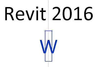
First up was the window tag & I immediately came across some interesting behaviour. The 'W' character in my window tags is plain text & the number is a standard label. Due to the upgrade, the 'W' character was shifting down and slightly to the right. So this is what I went to fix.

This text is center justified, it's not justified left or right. In Revit 2016, shifting the text box toggles left and right, has no effect on the position of the character. 

In Revit 2017, it moves to the right! For many of my families, this is what is causing the letters to shift horizontally, as my text boxes are quite tight around the letter.

I tested this theory by opening a Revit 2016 family and increasing the size of my text box to give the letter room to "grow". Then I upgraded it in Revit 2017 and it did not shift horizontally. 

So, is this a glitch? I would say so. I can't think of a reason why you would make a deliberate change in behaviour such as this. It is worth pointing out that you are very unlikely to come across this particular problem with slabs of text that are center justified because, well, you wouldn't reduce your text box to the width of a single character for text notes, unless of course you wanted vertically running text. This was only made obvious to me, because I was dealing with a single character in a family. I am not suggesting this is affecting center justified notes in a drawing.

I have posted in the forums and sent it to Autodesk regardless, as I am curious about the response to this unusual behaviour.

You can watch this behaviour in the following video. I have placed a reference plane through the centre of the character so the move can be seen more clearly.


It is worth noting I have installed Service Pack 1.